Page 1 of 1
ScIrE vs. PSPortable......Round 2 *winner: PSPortable

Posted:
Thu Mar 16, 2006 12:29 amby CLMT
Ok heres the second round rules:
Size: 400x200
Theme:Duddly Boys (not sure if there still wwe but o well)
Due:March 16
ScIrE vs. PSPortable
Posted:
Thu Mar 16, 2006 8:32 amby psicryptor
all the best clmt im rooting for you all the way but you better kick a** to get my vote

Posted:
Thu Mar 16, 2006 9:24 amby Surenix
The "dudley boys" are now called "team 3D" and there from TNA now.
- and It's on! you won't make it to round three..hehe  just playing.
Posted:
Thu Mar 16, 2006 5:04 pmby CLMT
Heres mine:
Posted:
Thu Mar 16, 2006 5:06 pmby Surenix
Posted:
Thu Mar 16, 2006 5:13 pmby CLMT
Ok Everyone vote!!!
Posted:
Thu Mar 16, 2006 5:17 pmby . Jachson
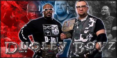
ScIrE:
I think the blending could use some work, and the main font looks choppy, the brush font could be better, the colour doesn't fit the Dudley Boyz, I also think the outer glow is a bad thing to it, not the best I have seen from you, and the brushing needs some work too.
PSPortable:
I think it is nice dude, blending is awsome, the main cut is great, and nicely placed, brushing is awsome, and the text effects are great, and the colour fits them so nicely, well done, best I have seen you do.
ScIrE Overall Rating - 7/10
PSPortable Overall Rating - 9/10
Winner In My Opinion: PSPortable
Posted:
Thu Mar 16, 2006 5:26 pmby .Vault
tough one...
- PSPortable
Good - I like the overall Apperence, everything blends well and i like the brushes you used for it. The text is well done aswell.
Bad - Its too Plain in color gets boring to look at after like 10 seconds...
- ScIrE
Good - It has very nice blending and its fun to look at. I like the brushes aswell. The blending between color is amzing aswell.
Bad - The only thing i can see wrong with it is the font (dudley boys). It is pritty ugly to looks at and its grainy and pixley, and its hard to read.
My Vote - ScIrE
Posted:
Thu Mar 16, 2006 6:08 pmby manh
my vote goes to Port. its a no brainer.
clmt's work is childplay compare to port's
simplicity vs. work of art
u guys know what i mean. all of clmt's work are the same, his first few are ok because we thought hes start to get some skills and implementing some new things, but after a few more pieces of work (c..r..a...u guys imaging the last letter) they all are the same thing over and over again.
Posted:
Thu Mar 16, 2006 6:09 pmby Samineru
SclrE, The main cuts are a little strange looking and in the background one of the cutshas a strange red spot on the middle of his head. PSPortable, It's a little simple but really well done. In my opinion, PSPortable is the winner.
Posted:
Thu Mar 16, 2006 6:11 pmby Surenix
PSPortable - 3
ScIrE - 1
keep it up!
Posted:
Thu Mar 16, 2006 6:16 pmby CLMT
Dude i think ur gonna win this one but we'll see and manh its cause i learn something new so i try it a few times then do something different im still learning so i like to get the hang of a style before i go to a new one plus i really dont have alot of brushes so i try to work with what i have.
Posted:
Thu Mar 16, 2006 6:38 pmby manh
but clmt, the truth is, yours not that bad, just not good enough to win this one, but iam sure if this was against some other guys u would win.
also, looking at port's pic it might look plain and simple. but to make it is not that easy, comparing to one with bunch of colour and cuts.
Posted:
Thu Mar 16, 2006 6:40 pmby CLMT
Believe me i know his won and i knew it when i saw it but u know i just need more brushes.
Posted:
Thu Mar 16, 2006 6:42 pmby Surenix
ScIrE wrote:Believe me i know his won and i knew it when i saw it but u know i just need more brushes.
