
![]() Fri Apr 21, 2006 11:39 am
Fri Apr 21, 2006 11:39 am
Juggernaut
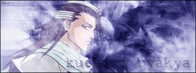
hey people i just came up with these  hope you like as its my first with transparency
please rate and comments etc..
ope you like


please rate and comments etc..
ope you like

![]() Fri Apr 21, 2006 11:39 am
Fri Apr 21, 2006 11:39 am
![]() Sat Apr 22, 2006 9:13 pm
Sat Apr 22, 2006 9:13 pm

Users browsing this forum: No registered users and 18 guests